Online tools that make training more efficient and productive
TARGET SOLUTIONS NEW DASHBOARD
About
- TargetSolutions creates innovative training management applications for public entities, existing to deliver dynamic, accredited online training courses, and cutting-edge records management technology for more than 2500 organizations.
Client
- TargetSolutions
INDUSTRY
- Education
RESPONSIBILITIES
- UX Design
- User Interface Design
- Information Architecture
- User Surveying
- HTML Prototyping
The TargetSolutions Story
In 2012, TargetSolutions goal was simple but revolutionary: build a world-class learning management system that would help organizations deliver and track training amongst multi-disciplinary groups in an efficient and cost-effective way. Their Learning and records management system was reimagined in 2012 to meet the training, record-keeping and continuing education needs of thousands of safety professionals nationwide. TargetSolutions continues to grow in popularity among local and state government agencies and private entities.
By The Numbers
890,000+
USERS
4.55
AVERAGE MINUTES PER SESSION

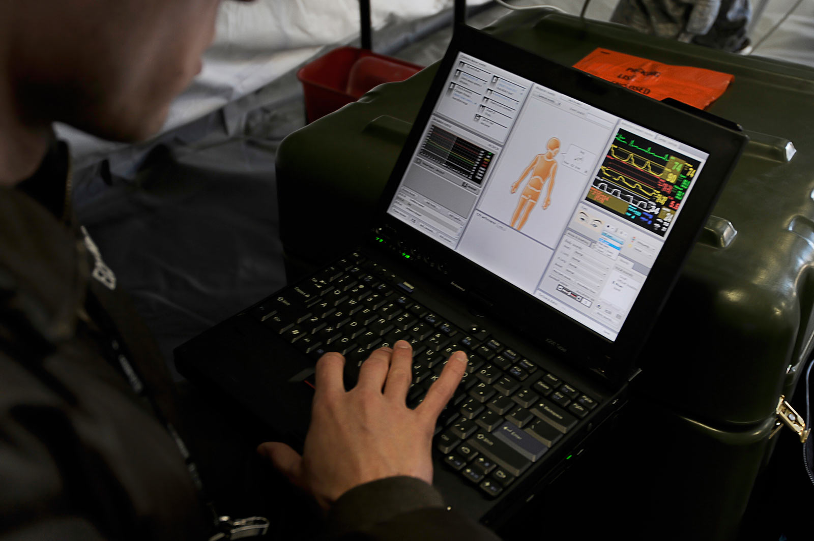
THE PROBLEM
Since 2012, I have worked side-by-side many talented teammates to continually improve upon our industry leading training platform. A continual task has been focused on increasing the amount of time our users spend with our apps. A goal for our product team is to have our users continually learning and utilizing our many features. An idea that we explored and designed was a revamping of the users homepage or dashboard.
THE PROCESS
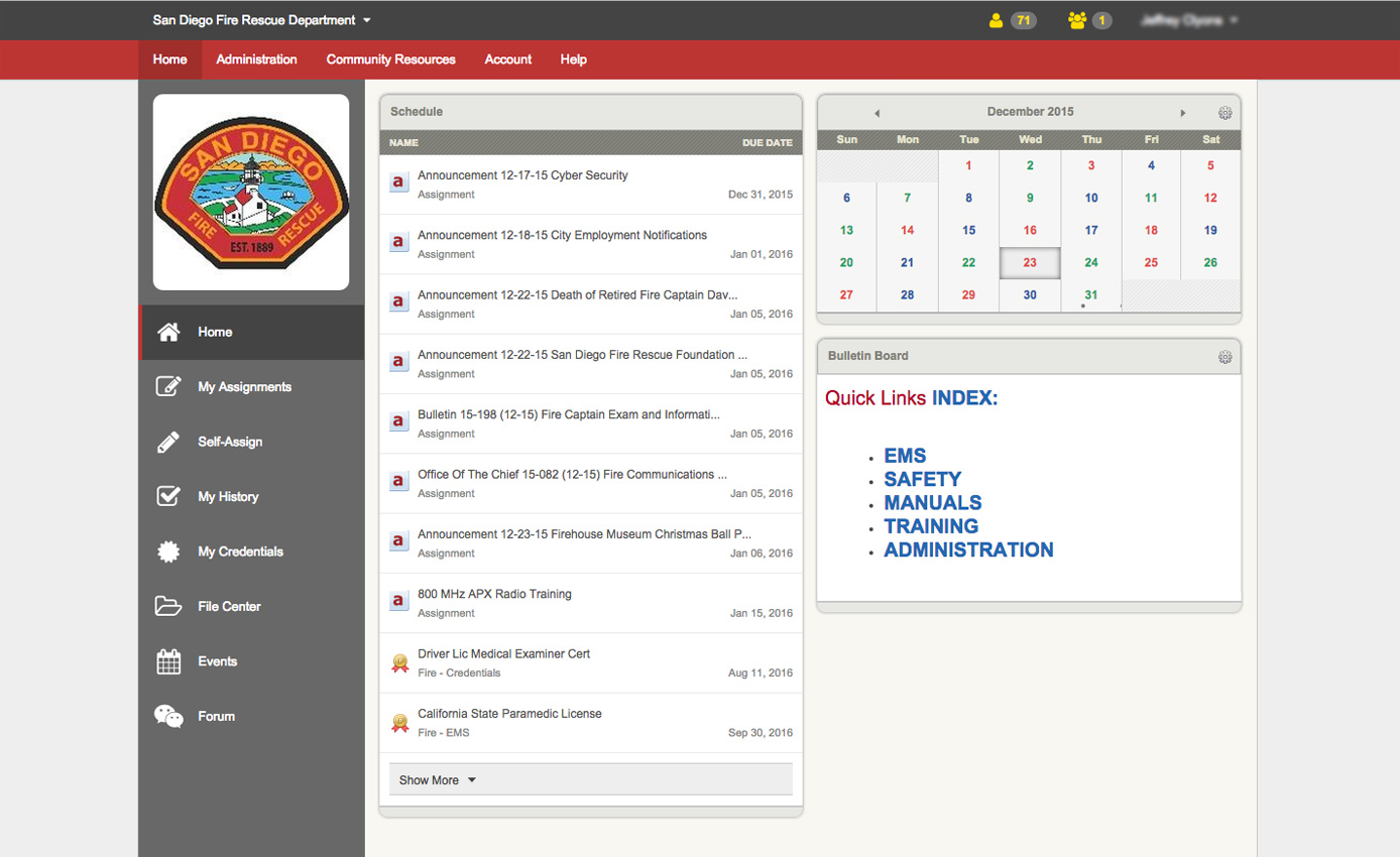
Through user research we found that users were having a difficult time finding the features that they most commonly used. Or, they bypassed the main content presented to them on their dashboard.
"It would be nice to have the ability to customize my homepage. So that I can view, at a glance, the things that are important to me."
 Stuart S. - Oceanside Fire Dept.
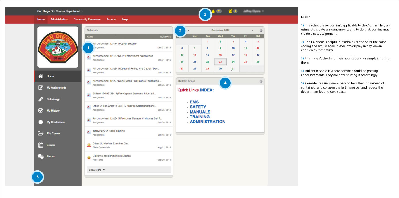
The task then was to revamp the UX and UI of the home dashboard. We came up with the idea to have a dashboard dynamically generate the user&as dashboard based on most utilized features. To redesign a new feature-rich dashboard required a page that was flexible and completely scalable. To achieve this I needed to completely re-engineer the experience to facilitate utilization for every unique circumstance. To achieve this wide scalability I implemented a modular design.
-
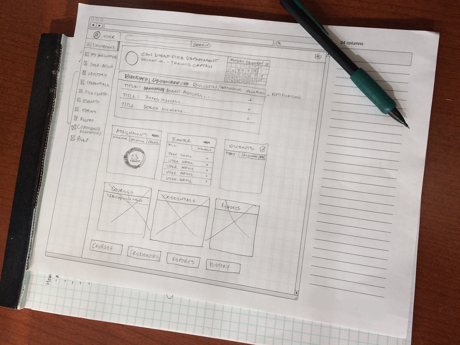
Initial sketches of the administrators dashboard as modular design.
-
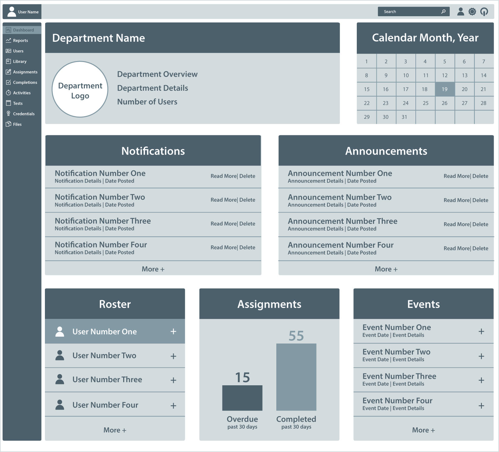
Wireframes of the new dashboard for Administrators.
-
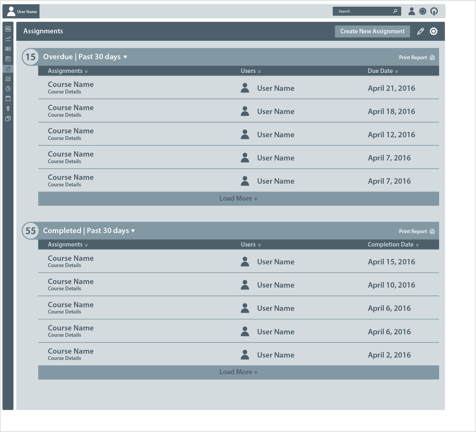
Wireframe of the new detail page view.
-
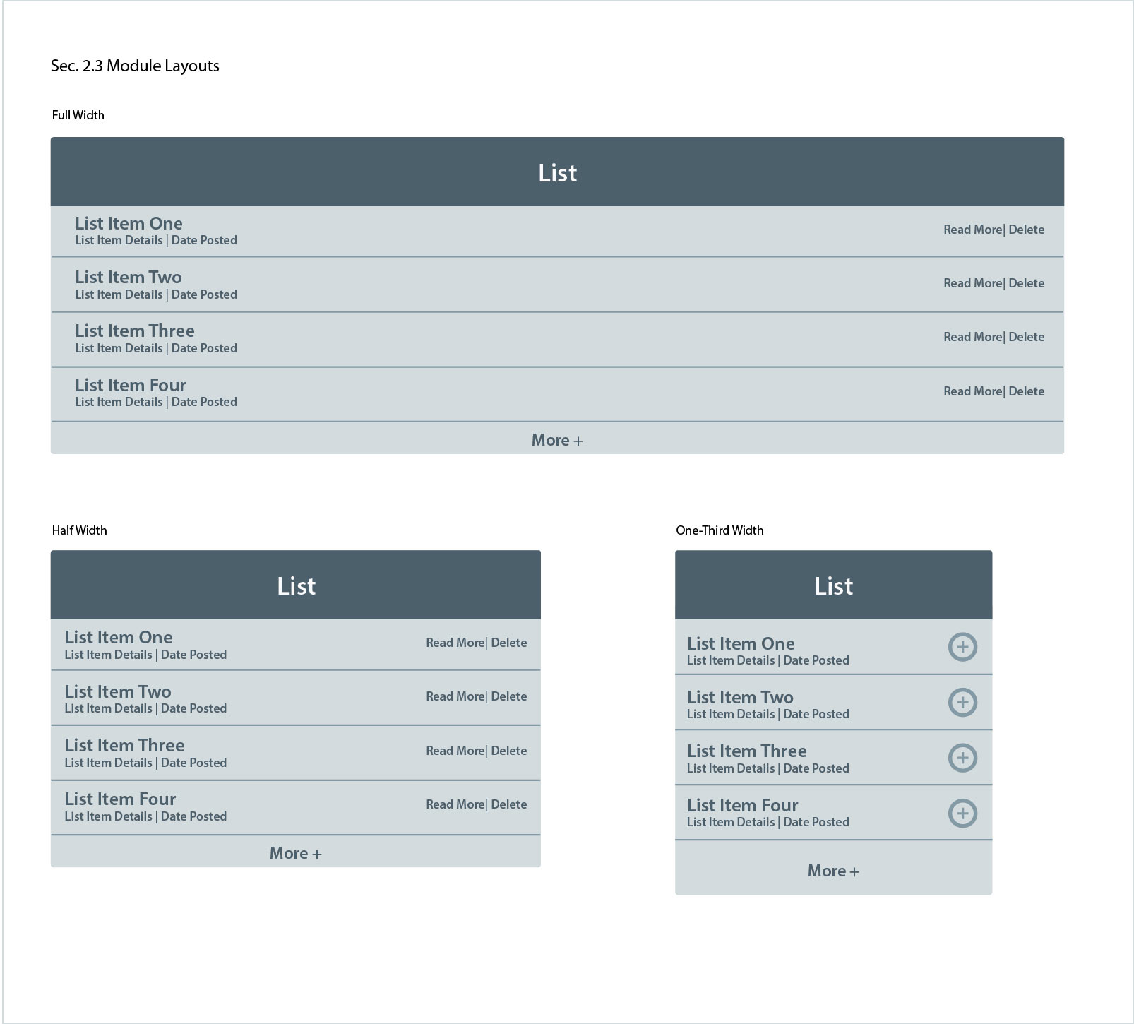
Wireframe of the modular layout options
-
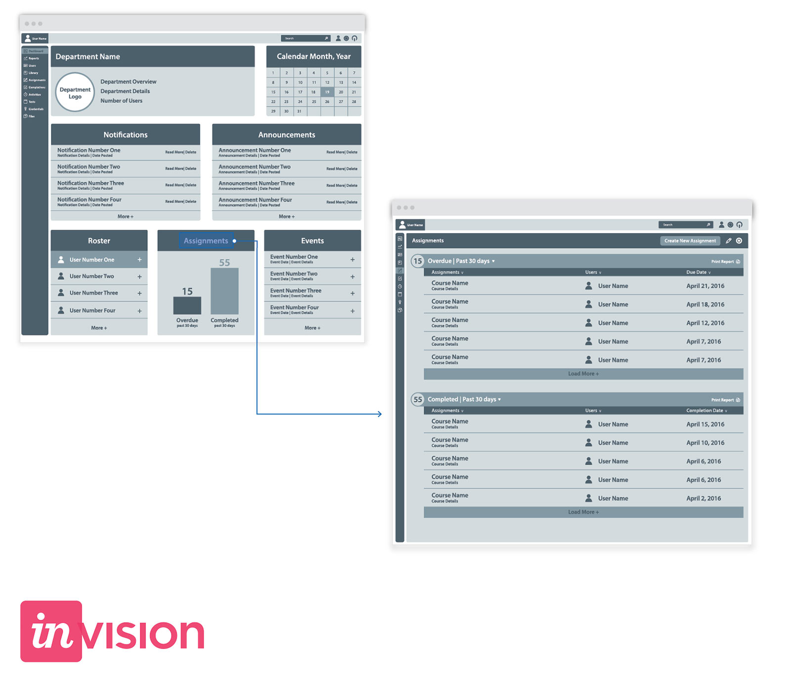
Prototyping the new admin. dashboard using the Invision app.
The Results
We currently are in beta-testing with the new design. But our initial feedback has been extremely positive. We've increased users time spent on our platform, and believe we collectively designed an all-encompassing solution.
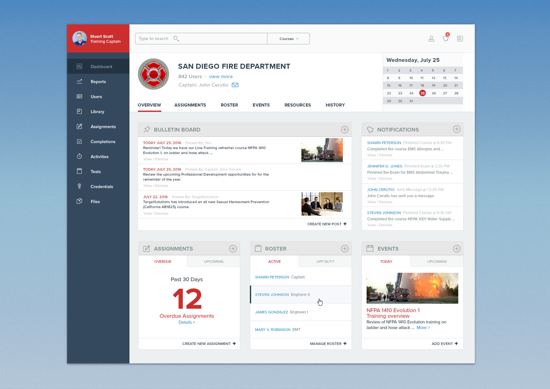
Screenshot of the newly designed administrators dashboard.
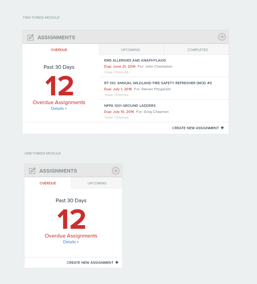
Module layout options for a two-thirds and one-third unit.
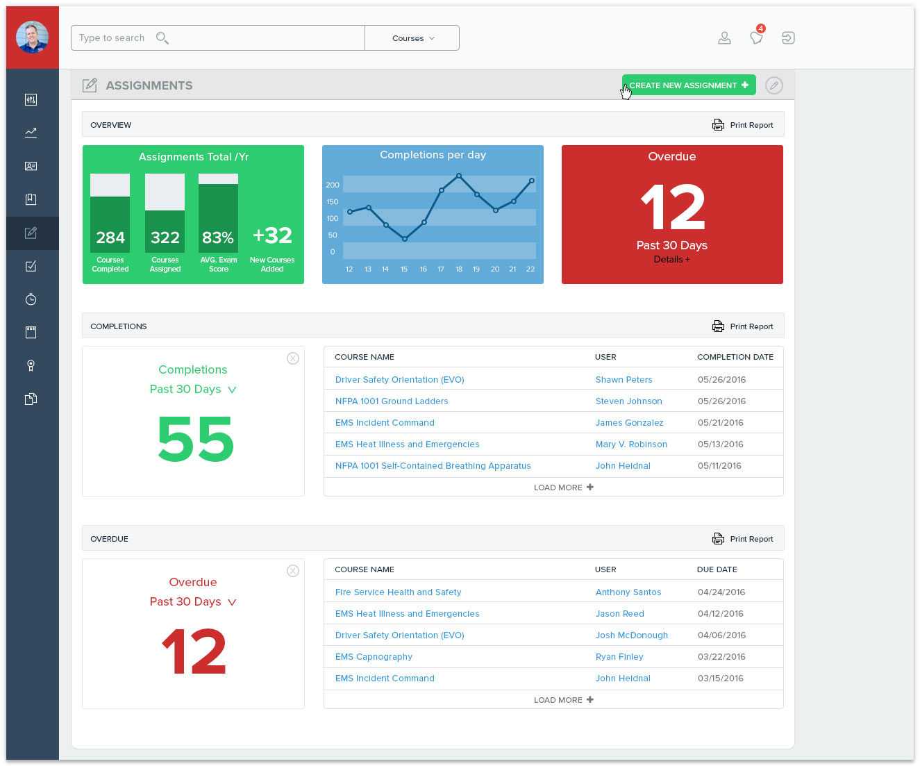
New Assignments feature page view.
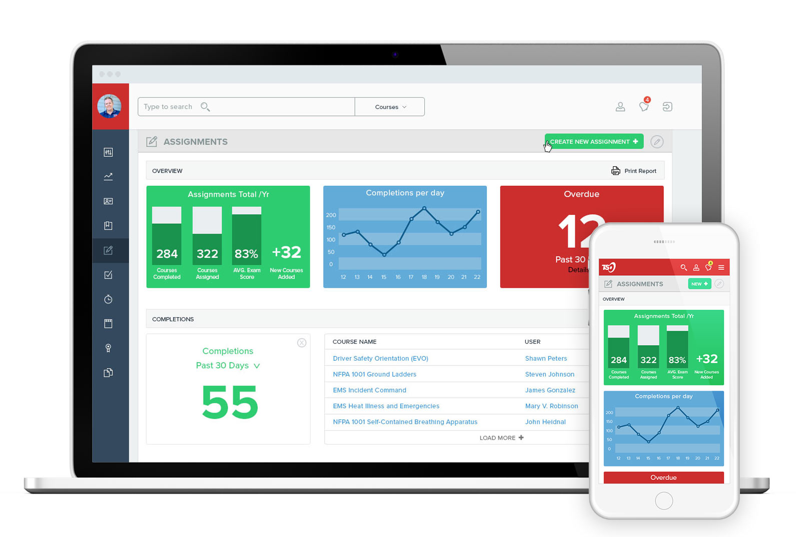
Responsive design for feature detailed view.